What's the importance of a brand's colors?
The colors of a brand are one of the most powerful tools for enhancing brand awareness and associations. There is a common misconception that a brand’s colors are just those used in the company’s logo, and everything else can be adapted to the platform or use case. But it’s so much more than that. The color palette you choose in your brand kit should be consistent across your entire brand infrastructure. You need to align all your visual elements, such as the homepage, your app, product packaging, social media platforms, user manuals, and banners, with your brand colors to create a broad and unified brand identity
HOW DO COLORS INFLUENCE THE EMOTIONS OF THE AUDIENCE?
The psychology of colors is a theory created by great scholars that aims to describe, in practical terms, the sensations each color conveys to viewers. In the field of web design, this theory underscores the need for a clear analysis of the colors that best align with the visual identity and branding goals.
For this, Inclusion will guide you through six steps to help you choose brand colors that appeal to your potential customers.
1. Define Your Brand Identity
You’ve most likely done this already, but let’s revisit it. To better understand who you are as a brand, Inclusion has prepared a few questions for you:
– What is your mission as a company?
– What are your values and beliefs?
– If your brand were a person, what characteristics would it have?
– What communication style would they use?
– What are the unique aspects of your business?
By clarifying the answers to these questions, it becomes easier to see the bigger picture and decide which brand colors create associations that support your mission, values, and personality.
2. Define Your Audience
As we’ve learned, the impact of brand colors depends on the emotions they evoke. Many factors influence how the human brain perceives different colors.
That’s why you need to ensure you know your audience well. When considering your target audience, ask yourself these questions:
-Try to define the age, gender, location, and cultural aspects of your target audience. Are there specific color associations for this group?
– How do you want them to perceive your brand?
– What are they looking for in your product?
– What emotion would drive them to make a purchase?

3. Explore the Meaning of Brand Colors
Once you have the answers to the previous questions, you can start associating them with potential brand colors.
Although the perception of brand colors is subjective and based on many external factors such as cultural differences, time, shades, tones, and color combinations, there are several color theories that attempt to explain the meanings of colors.
Here are the meanings of the most popular brand colors in brief:
Meaning of the Color Red
Red is associated with passion, energy, and danger. It is also commonly used as a brand color to encourage action, such as in CTA buttons on websites, or to stimulate appetite. That’s why you’ll find red elements in many fast-food logos.

Meaning of the Color Orange
Orange represents creativity, youth, and enthusiasm. It combines the warmth of red with the playful aspect of yellow. Orange is an excellent choice for young and creative brands. Additionally, it can be used to draw attention to something or to promote an action.

Meaning of the Color Yellow
Yellow spreads happiness, hope, and positivity. It is generally associated with joy because it is the color of smiling faces and the sun. Yellow is the perfect choice for grabbing attention instantly. However, it is often linked with low prices.

Meaning of the Color Blue
Blue symbolizes peace, trust, intelligence, and professionalism. No surprise, it is the most popular color worldwide, both for personal preferences and brand colors. You can often see it in the logos of tech companies, financial institutions, large corporations, and social media platforms. If you want your brand to be immediately associated with professionalism and trust, blue is a safe choice.

Meaning of the Color Black
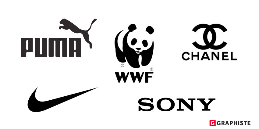
Le noir est synonyme de puissance, d’élégance et de sophistication. Il est couramment utilisé dans la conception graphique le noir peut être audacieux en soi, ajouter une belle touche de détails ou fournir une combinaison super puissante avec n’importe quelle autre couleur (par exemple, l’argent pour l’exclusivité ou le néon brillant pour un look chic et moderne).
Meaning of the Color White
White conveys simplicity, minimalism, and aesthetics. It is the most neutral color and can be very useful in your brand’s color palette for elements such as web pages, packaging, or secondary accents. The combination of white and pastels creates a soft and light feel. White and black together offer a chic minimalism, while adding gold elements can create a luxurious yet pure design.

4. Explore Your Competitors
Your logo and advertising banners are just a few elements of your brand identity that you want to make unique and not confused with other brands. Before ordering new business cards with your brand’s new colors, explore your competitors.
Even if you’re in the ketchup business and all your competitors use red and look very similar, find something unique about your brand. Perhaps it’s your sustainable production or reusable materials in packaging. Be different, be bold, and try to make a splash in the grocery aisle.

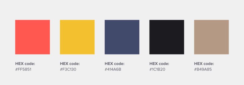
5. Create a Brand Color Palette
When it comes to combining colors, the color wheel is a very useful tool. It is a circle divided into several basic hues: primary, secondary, and tertiary colors.
Using the color wheel can follow certain styles. For example, if the chosen base color, considering the brand’s personality, is blue, you might opt for monochromatic colors, selecting lighter shades of blue when adding white or darker blues when adding black. This style is classic, harmonious, and suitable for almost any brand.
For bolder combinations, consider using complementary colors: for instance, if you choose blue, pair it with a color directly opposite on the color wheel, such as an orange shade. Using complementary colors maintains harmony but adds more boldness to the palette.
Additionally, you can choose a palette with broader tones on the color wheel. For example, you could combine a shade of blue with a shade of purple and a shade of yellow. Since these colors have different psychological effects and properties, they evoke a sense of creativity and energy, which can be interesting for your marketing strategy.
6. Create Brand Assets
Presentations, virtual meeting backgrounds, videos, reports, email banners, and all other external content from your business should be on-brand.
The easiest way to bring your brand colors to life is to create a brand kit before you start designing brand elements. By doing this, you not only help yourself but also provide your design team with everything they need to keep all visual materials consistent with your brand.
